UX Case study for Once & Floral Responsive web design by Tina Hoveyda
Coursera, Google UX Design
July 2023
The Product
Once & Floral website strives to provide a perfect place for busy people who want to show their love and support for their dear ones, from far away, by sending flowers, thus the slogan “Brings Together, Rekindles Love”. The target audience is both male and female, 25-60, busy working adults (gift-givers), and also corporate buyers.
Project Duration
June 2023- July 2023
My Role
UX and UI designer leading the Once & Floral website design
The Problem
There was a need for an efficient and time-saving online flower-shop that could guarantee the quality of their products and precision in their deliveries. Also lack of a cohesive customization feature was a source of frustration.
The Goal
Design a website with a simple and straight-forward navigation that also provided clear customization feature and well-categorized product display.
Responsibilities
Conducting interviews, creating empathy maps, personas, competitors analysis, sitemap, affinity map, patterns and insight analysis, paper and digital wireframing, low and high-fidelity prototyping, conducting usability studies, accounting for accessibility, iterating on designs and responsive design, visual design and copywriting.
User research: Summary
I started by conducting user interviews, which I then turned into empathy maps to better understand the target user and their needs. I discovered that many target users were concerned with the quality of the received product and sometimes frustrated with the delivery system. Also other florist’s websites did not provide a cohesive bouquet customization feature, which was exactly what some users were looking for.
Pain Points
Navigation
Some florist websites are too dense with information and not well-categorized, resulting in confusion.
Features
Most florist websites do not provide a bouquet- customization feature, or not a simple and cohesive one.
Experience
Products of some websites do not match the appearance or quality of their images, leading to user’s disappointment.
Persona-1
David
Age:
Education:
Hometown:
Family:
Occupation:
41
University degree
Pompton lakes, NJ
Married, no kids
Architect
“I want to show my support and affection through flowers, even when I’m not around.”
David is a busy architect that loves his job. He is creative and ambitious. He also loves his family and spending time with his wife. Sometimes David has to travel to be on an architectural site and his busy schedule might prevent him from being there for his wife on special occasions. Since his wife loves flowers, he wants to show his affection by sending some customized bouquets on different occasions and sometime for no reason at all!
Goals
To be sure about the good quality of the flowers.
Ability to customize flower bouquets.
Good prices since he orders more than 5 times a year.
Simple and fast ordering process.
Frustrations
Sometimes the delivered flowers are not fresh.
The bouquet doesn’t exactly match his customization.
Delivery time is not accurate.
Problem Statement
David is a busy architect who needs to have fresh flowers delivered timely to his wife, because he wants to show his love and support when he is not around.
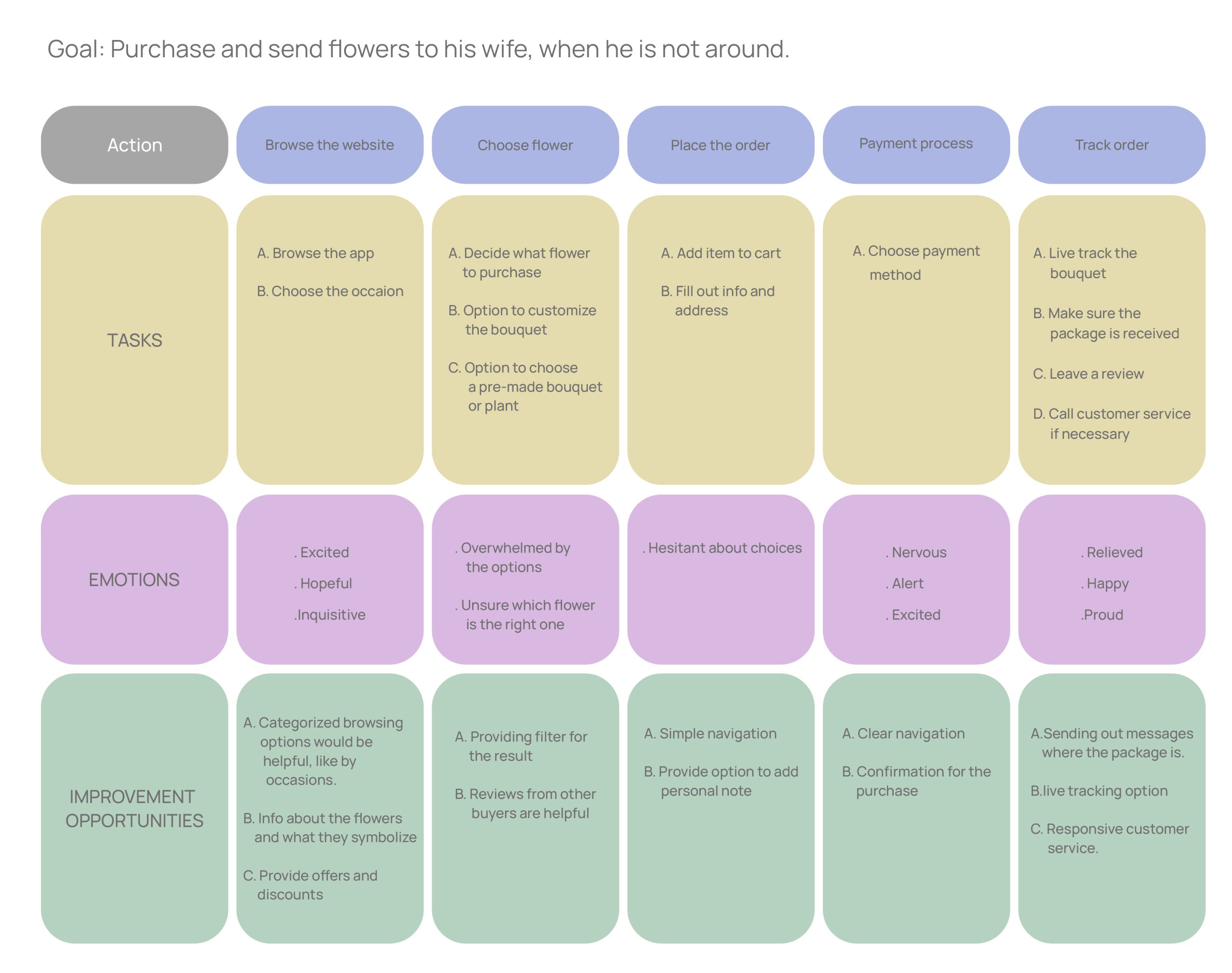
User journey map
I created a user journey map of David’s experience using the site to help identify possible pain points and improvement opportunities.
Sitemap
Paper wireframes
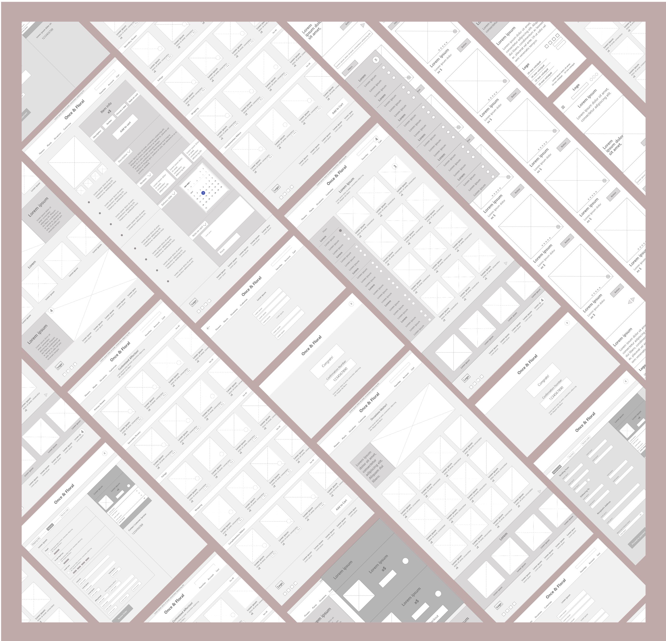
Digital wireframes
Low-fidelity prototype
Usability studies
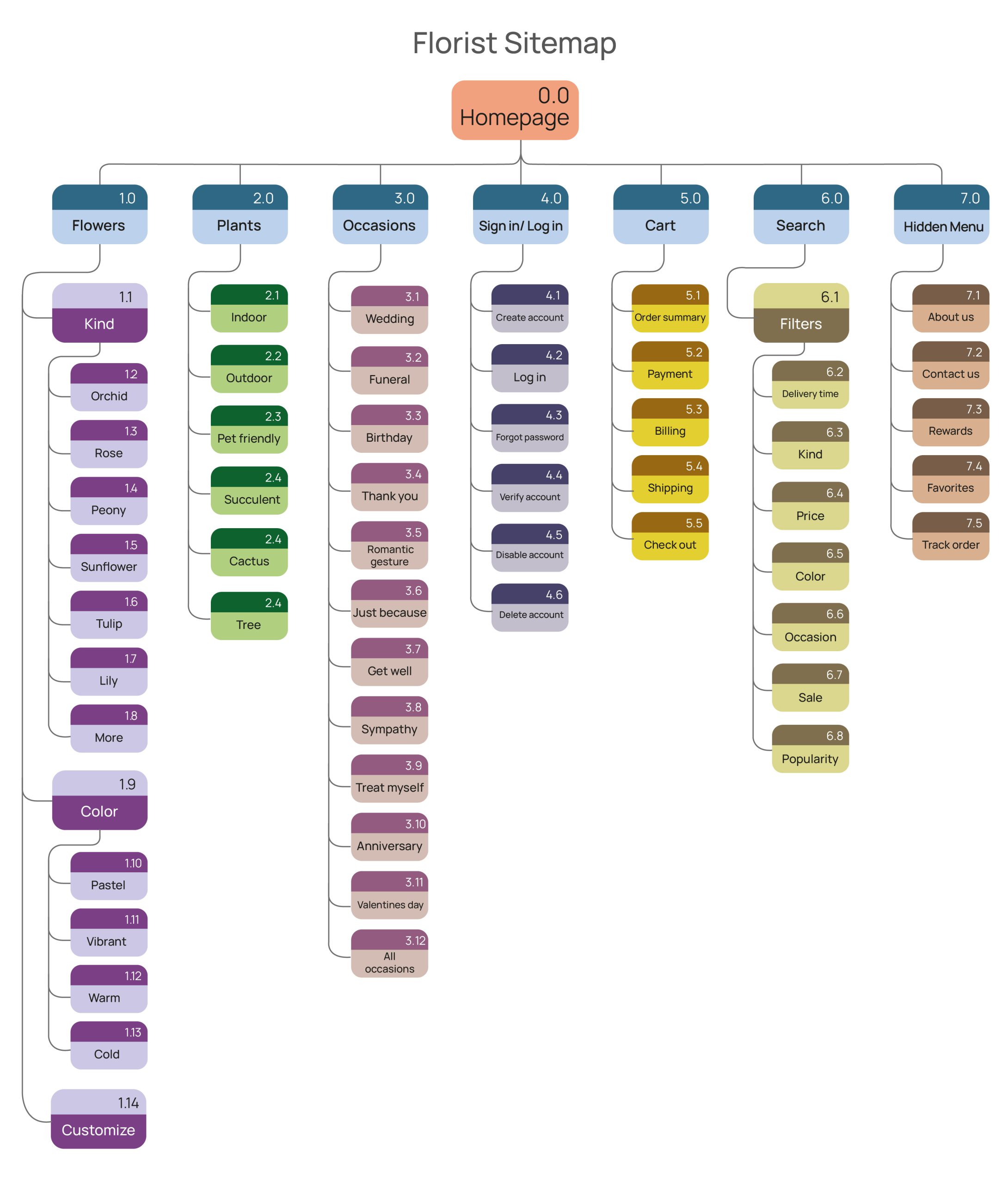
Sitemap
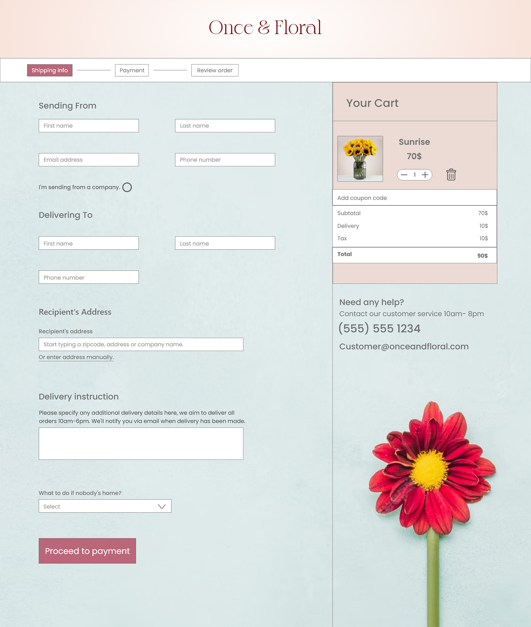
My goal here was to make strategic information architecture decisions that would improve overall website navigation and would lead to a well-categorized display of products and information. The structure I chose was designed to make placing order a simple and easy task.
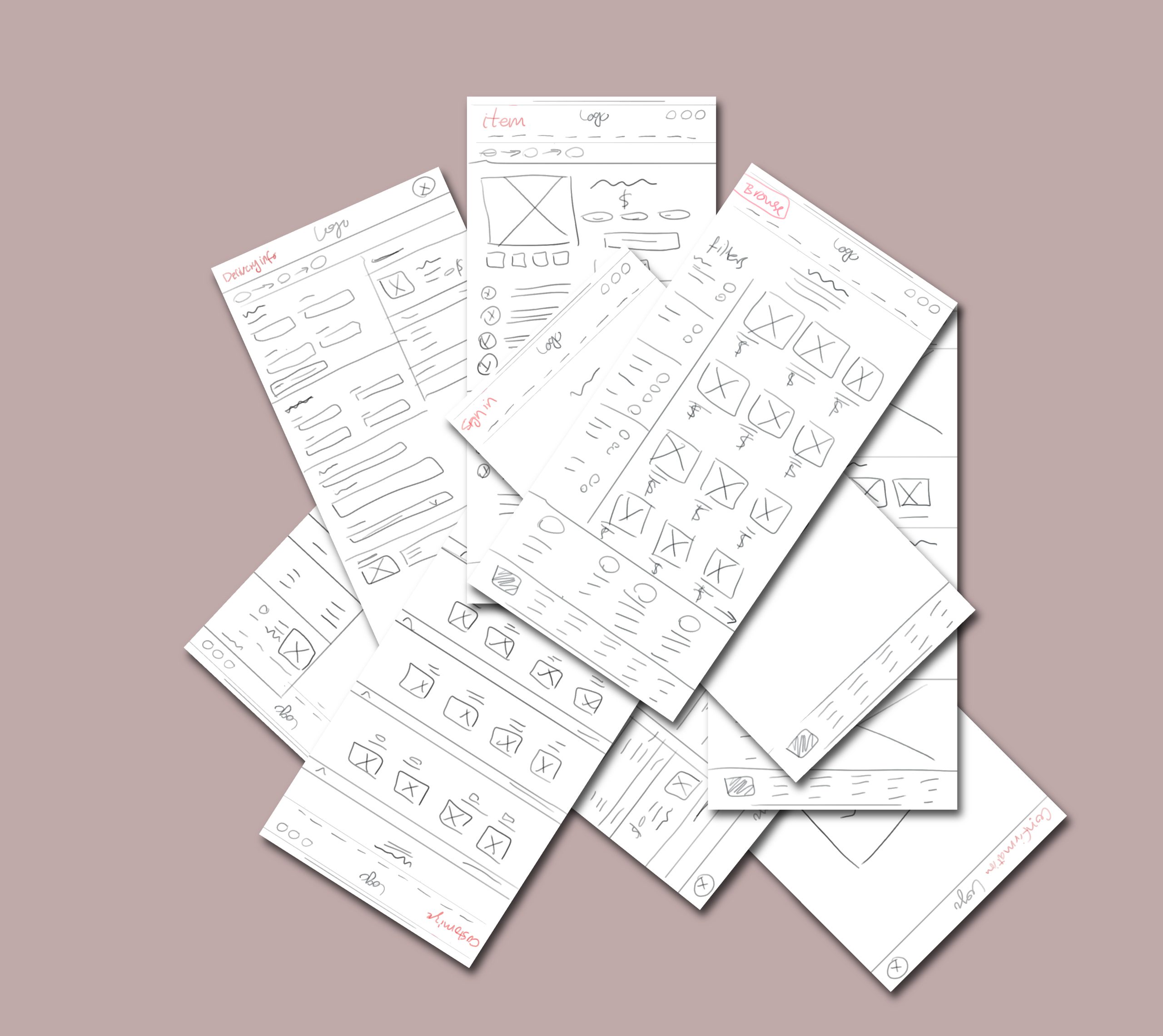
Paper wireframe
Next, I sketched out paper wireframes for each screen in my website. Having the user pain points in mind, I aimed to address them and create a simple flow and joyful experience. Categorizing information and product display, all with the goal to optimize the navigation flow. Emphasizing on the Reviews section in order to guarantee the quality of the product, which was a main user concern. And figuring out the best solution for the Customization section to be simple and fun.
Digital wireframe
Moving from paper to digital wireframes made it easy to understand how the redesign could help address user pain points and improve the user experience. The homepage has to make a good first impression and indicate a clear navigation. Prioritizing useful button locations and visual element placement on the home page was a key part of my strategy.
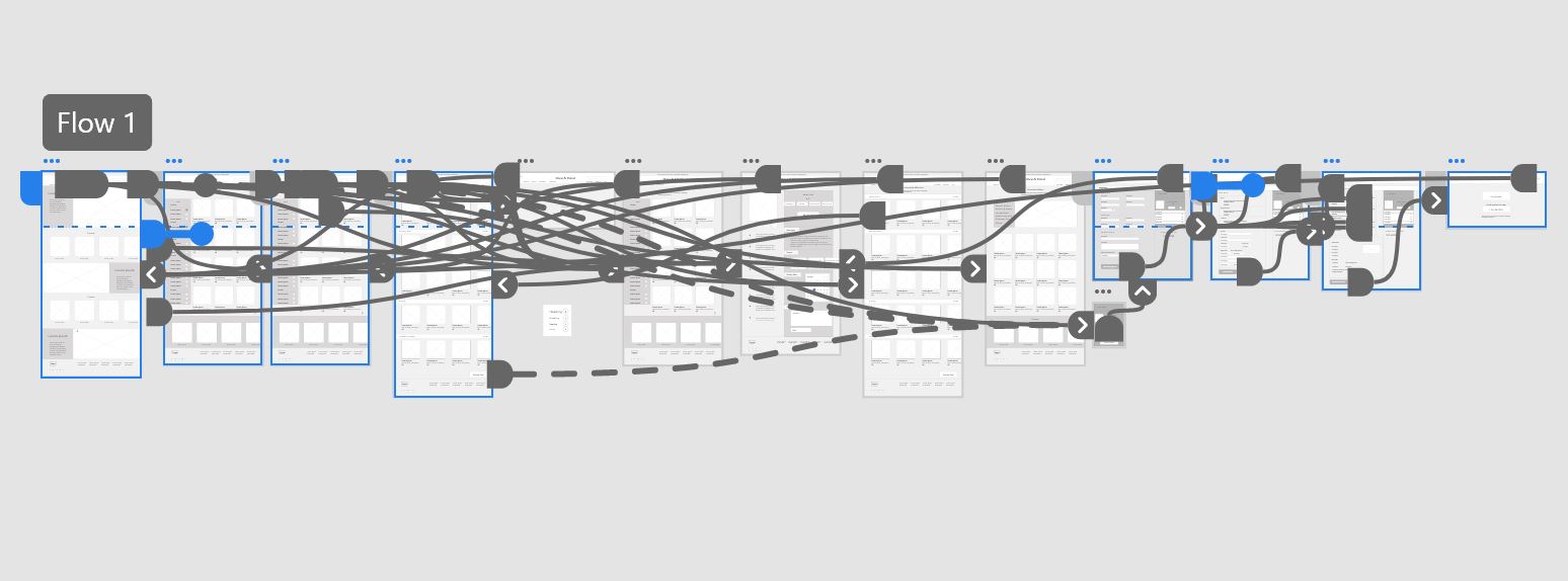
Low-fidelity prototype
To create a low-fidelity prototype, I connected all of the screens involved in the primary user flow of adding an item to the cart and checking out. Testing the prototype, users found the flow easy to follow and the customization feature simple and fun.
Usability study: Parameters
Study type Unmoderated usability study
Location United States, remote
Participants 5 participants
Length 20-30 minutes
Usability study:
Findings
Review-order page
Once the checkout was complete, user expected a Review Order page which the design lacked.
Experience
In the Customize section, besides choosing the desired objects, users also preferred to be able to choose the “color” without being redirected to a new page.
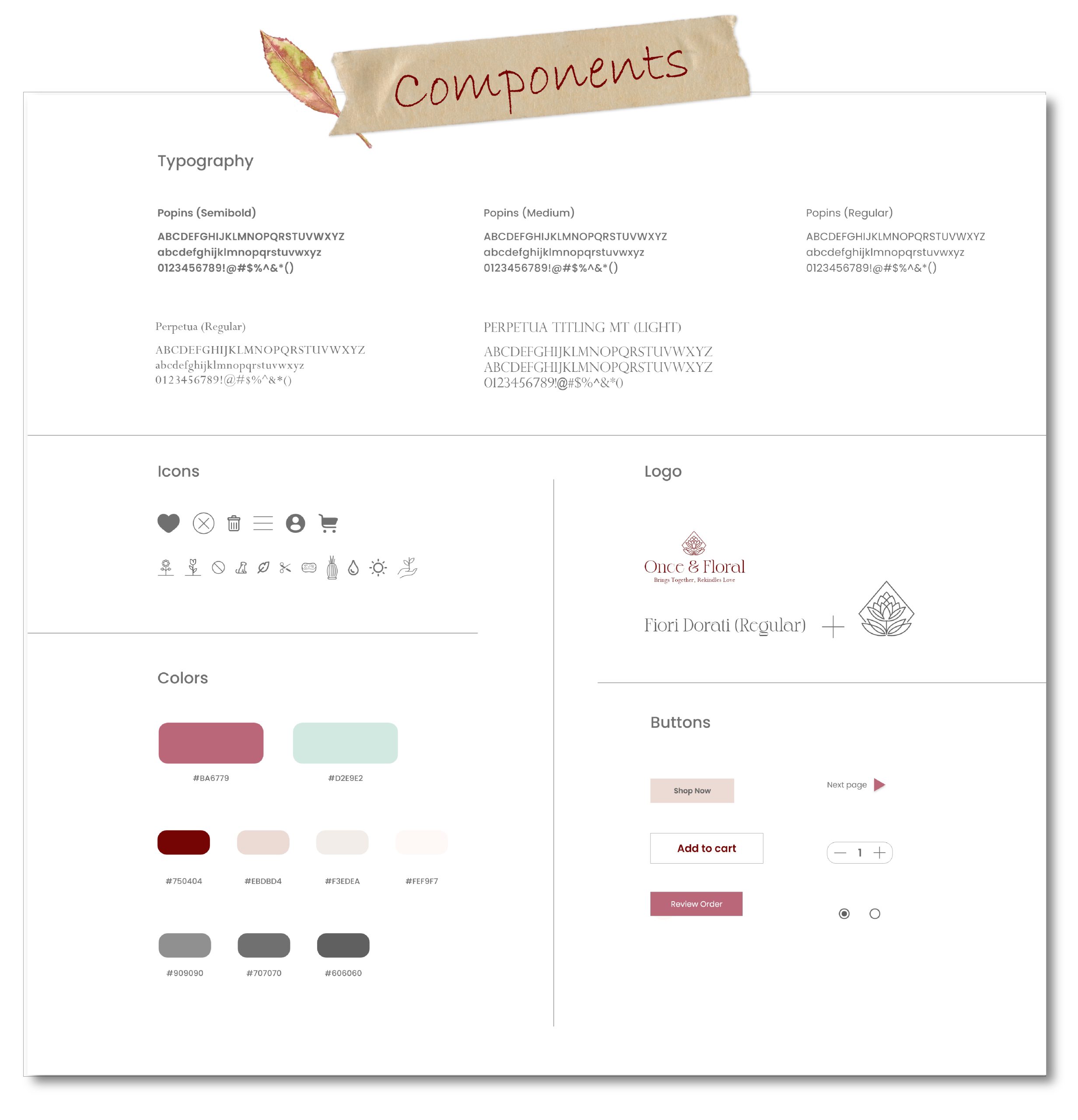
Components
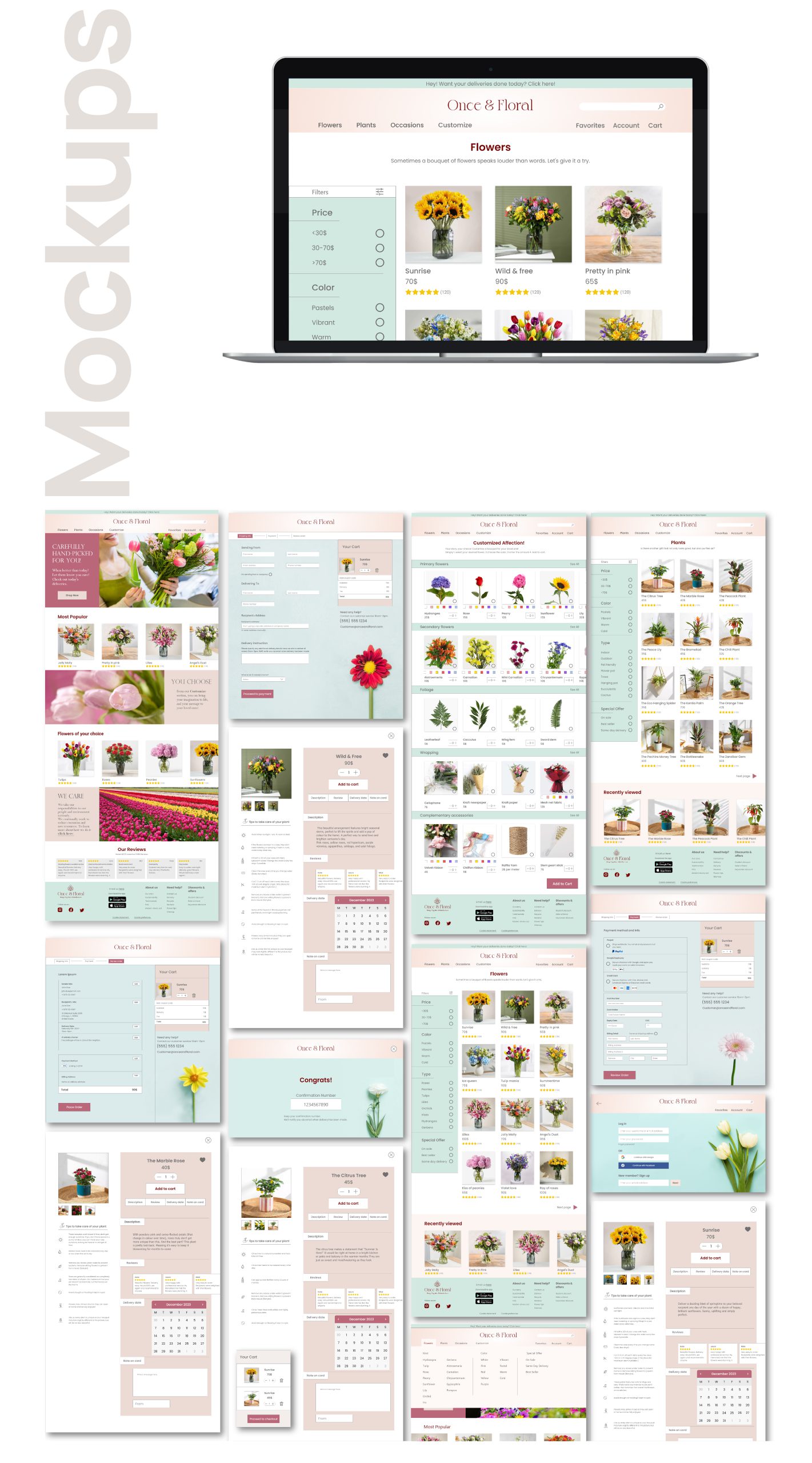
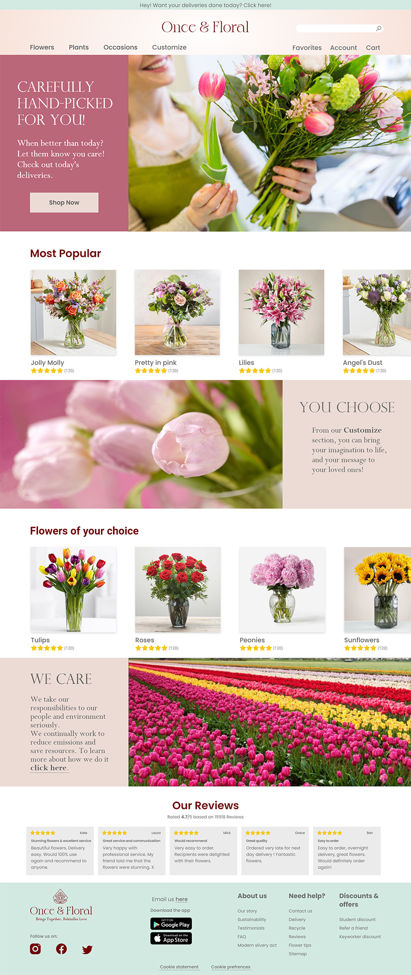
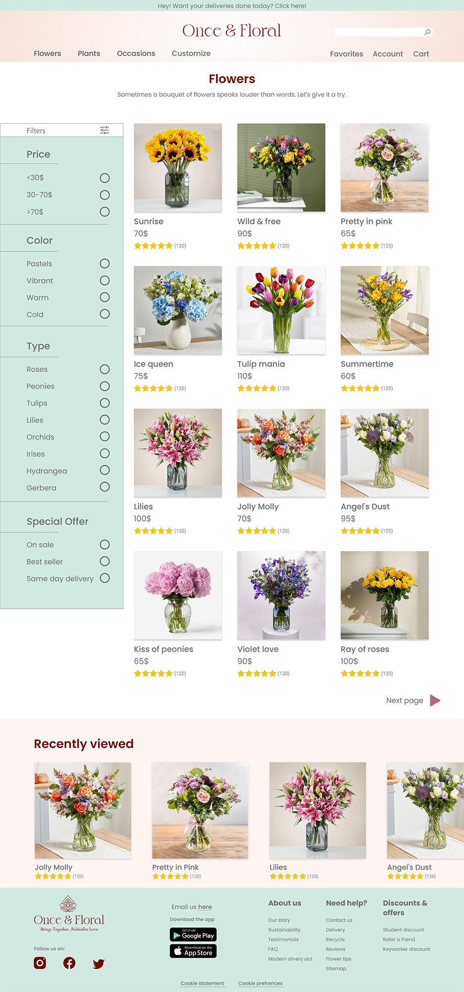
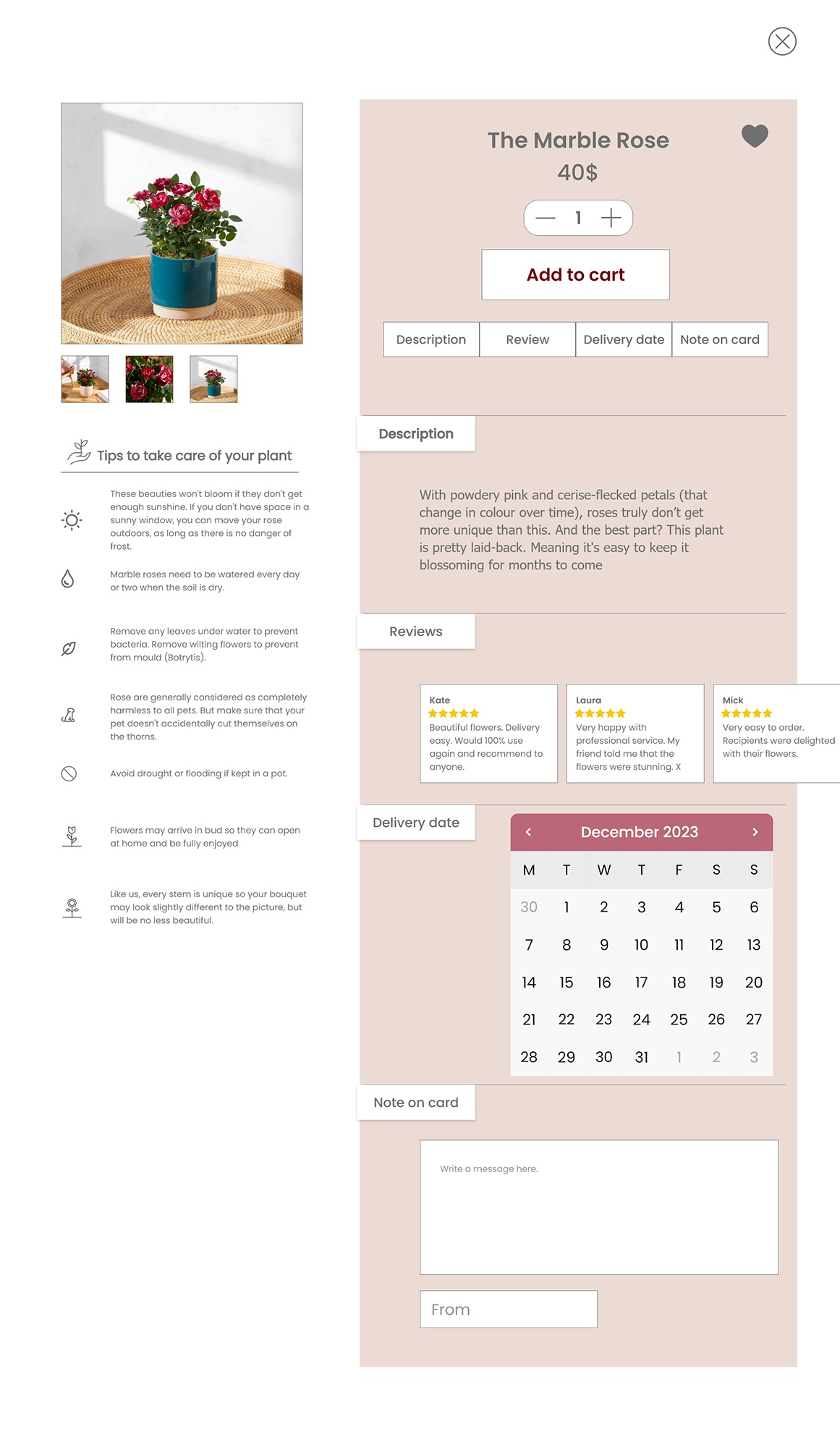
Mockups
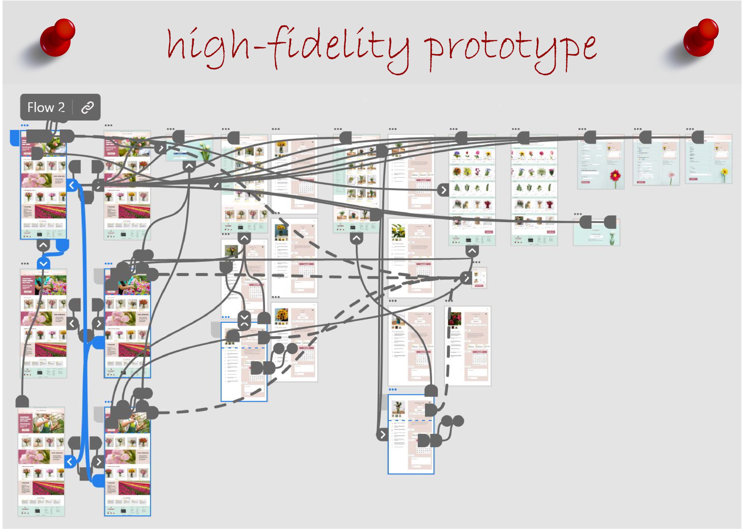
High-fidelity prototype
Accessibility
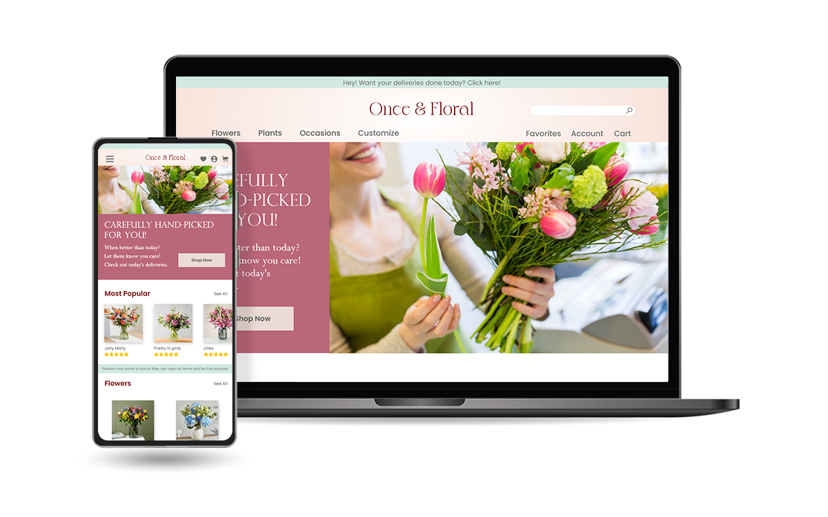
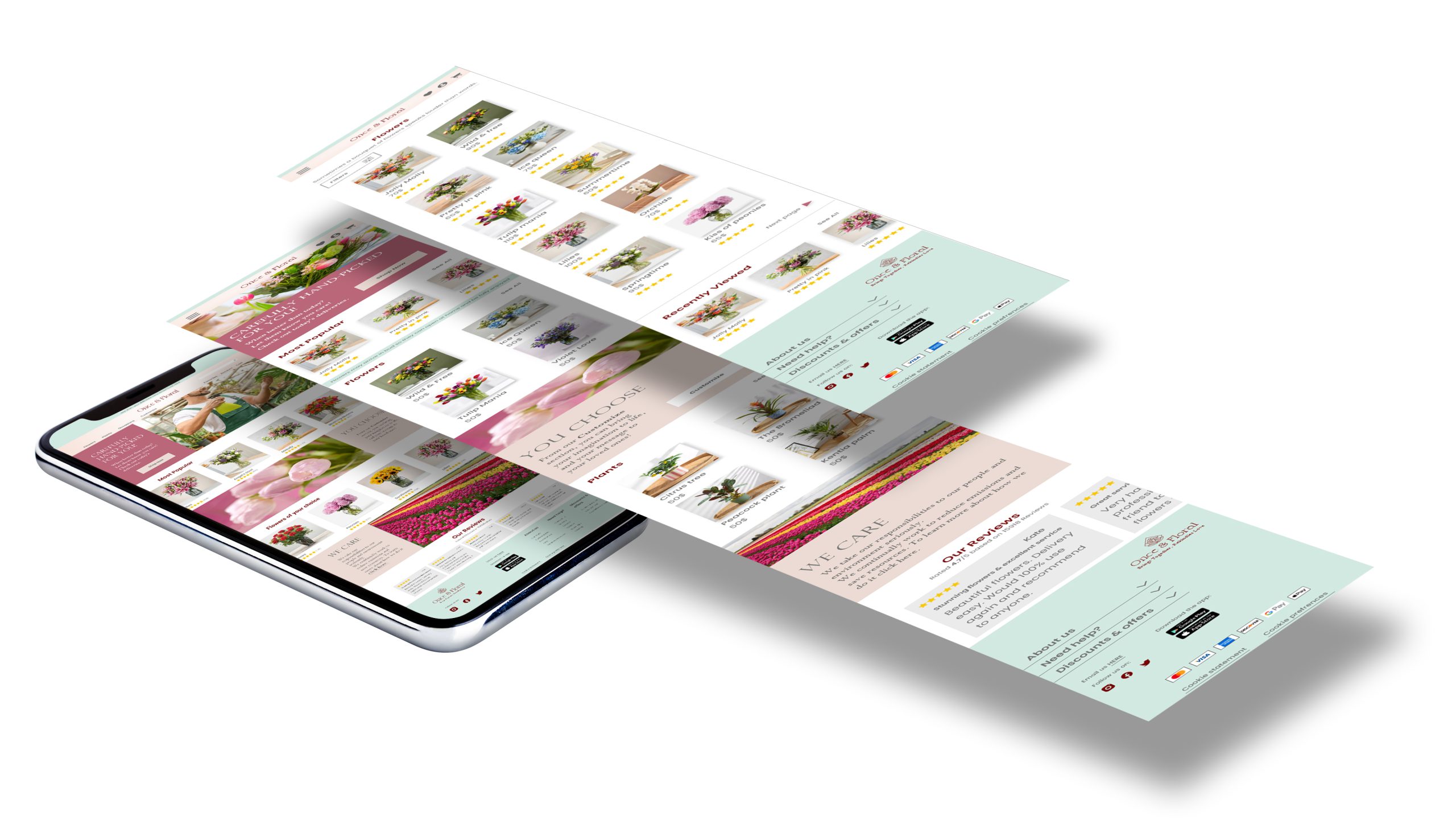
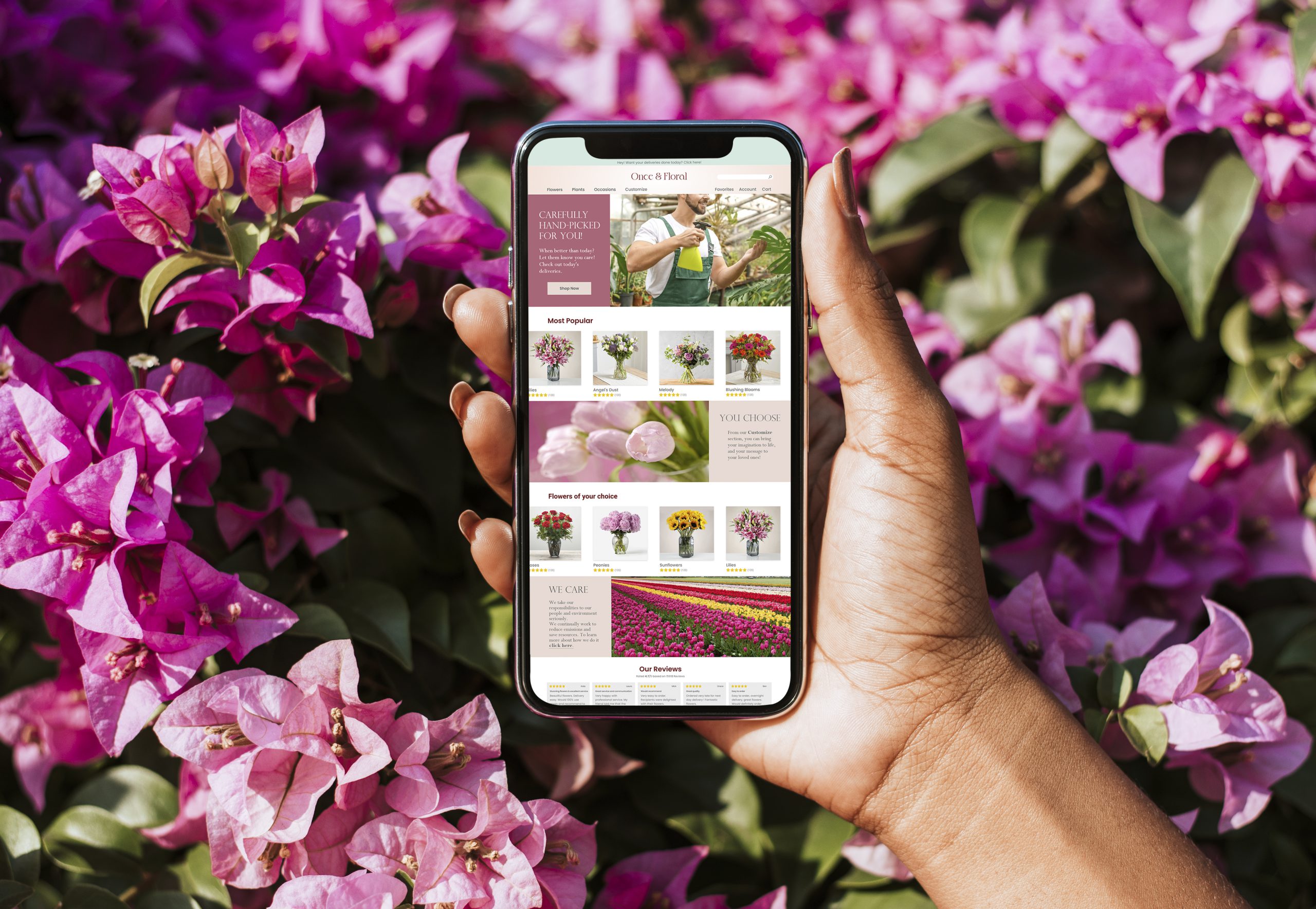
Mockups: Screen size variations
I included considerations for additional screen sizes in my mockups based on my earlier wireframes. Because users shop from a variety of devices, I felt it was important to optimize the browsing experience for a range of device sizes, such as mobile so users have the smoothest experience possible.
To check out the high-fidelity prototype click here
Accessibility considerations
Use of headings with different sized text for clear visual hierarchy
Divided by landmarks to help users navigate the site, including users who rely on assistive technologies
Color contrast and font size were considered to provide for inclusive needs
Takeaways
Next steps
Impact
Our target users found the experience joyful and the navigation easy to follow through. According to the feedbacks, the solution to make the Customize feature engaging yet simple, turned out to be a success. The aim here was to make the user feel welcome and gain their trust, in order to encourage them to return.
Next steps
Conduct follow-up usability testing on the new website.
Conduct a new research for a more progressed version of website which provides service and shipping internationally.
What I learned
During my research and interviews I learned that simply providing good products, is not what turns users into faithful fans. One key factor is the “attitude” of the brand. It encourages people to be better and do better when the brand they are purchasing from, is responsible about humanity and environment.