
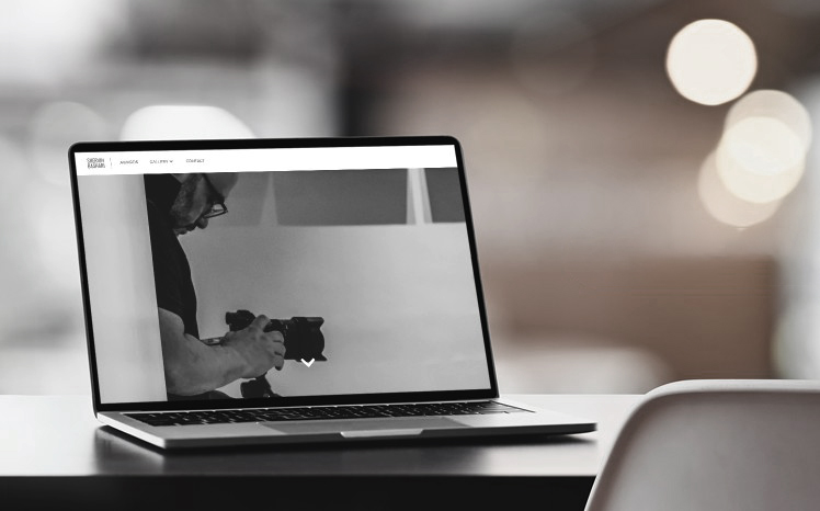
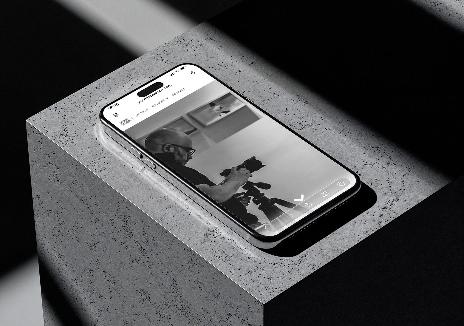
A responsive portfolio website designed to showcase the work of international award-winning photographer Shervin Bashari, balancing editorial minimalism with an immersive viewing experience.
Portfolio website for an international award-winning photographer
August-September 2026
Designed and developed a responsive WordPress website using Elementor, tailoring the experience to the client’s artistic vision and functional needs.
Present Shervin’s photography in a coherent, visually compelling portfolio that emphasizes the work itself while eliminating unnecessary distractions.
Although Shervin’s work spans multiple genres, he primarily identifies as an editorial photographer and photojournalist. His award-winning photographs emerge from the combination of a refined artistic eye and the ability to be in the right place at the right moment—a balance of observation, timing, and storytelling.

After discussing the visual direction of the portfolio, we chose a minimalist black-and-white approach rooted in the quiet, direct character of traditional newspapers. The interface deliberately recedes into the background, allowing the photographs to speak for themselves. Even color photographs appear as black-and-white previews throughout the desktop experience, creating a consistent visual rhythm. The only exception is the Awards page, where previews remain in their original colors to preserve the integrity of the recognized works.
The mobile experience follows a different approach. Since hover interactions are unavailable on touch devices, photograph previews appear in their original form—whether black and white or color—allowing visitors to distinguish each work without relying on hover states.
As the designer, I couldn’t resist adding a subtle moment of playfulness to the opening experience. The landing page recreates the feeling of looking through a camera before focus is achieved: visitors are greeted by a blurred scene and a camera shutter, with a simple prompt inviting them to press the shutter. The click brings the interface into focus, accompanied by a shutter sound that reinforces the tactile experience and makes the first interaction feel like taking the photograph itself.
The visual language is intentionally restrained, allowing the photographs to remain the focal point throughout the experience.
Color Palette: Black, white, and neutral tones reinforce the site’s editorial character while minimizing visual distractions.
Typography: Montserrat and Roboto create a deliberate contrast between vertical and horizontal proportions, establishing a clear visual hierarchy without competing with the imagery. I intentionally avoided serif typefaces, as the goal was to reflect contemporary photography rather than evoke the traditional conventions of printed newspapers.
For this project, exhibiting an artist’s works digitally, I prioritize listening before designing. Every project asks for a different visual language, and I believe the strongest solution is the one that gives the work—and the person behind it—the voice it needs to be visually heard.